

· PHOTOGRAPHY ·
17 Practical Techniques that Guarantee to Elevate Your Travel Photo Editing
Scribbled by Claire ◊ 27 Dec 2024
Travel photography can be a complex task, one that can be made significantly easier with a little bit of photo editing. Here, we talk about loads of ways that you can make your photos pop, in an elegant way, to make them worth of your wall!

Travel photography is hard.
As I explained in my tips for taking better travel photos, the changeable environments and unpredictable nature of travel mean you don’t always have ideal conditions, or enough preparation, to take the absolute perfect shot, every time. However, effective photo editing techniques can help remedy that.
I’ve spent years wandering the world, gradually producing better and better pictures (it’s a never-ending journey). However, there are always moments with extremely challenging circumstances and chaotic situations, that have resulted in slightly less-than-optimal photos. Or, conversely, the photo is just not as artistic or cinematic as I’d have hoped, despite ideal conditions.
So, maybe you visited the most beautiful place in the world, but the light was flat and grey. Perhaps it was just a little too dark to capture anything well. Was the scenery just a tiny bit washed out? Or, maybe, you just wish that your subject popped that little bit more. If so, then I’m here to help transform your photo into a sophisticated image that looks just like you remember in the moment.

IN THIS GUIDE //
Travel Photo Editing Tips
SOFTWARE FOR PHOTO EDITING
– LIGHTROOM OR PHOTOSHOP?
ABOUT THESE EDITING TIPS
WHY IS TRAVEL PHOTOGRAPHY EDITING UNIQUE?
WHAT IS MASKING IN LIGHTROOM?
TRAVEL PHOTOGRAPHY EDITING TIPS
INTERMEDIATE EDITING TIPS
– EXPOSURE
– FOCAL POINTS
– BLACK AND WHITE
– SKIN TONES
– DENOISE
– IDENTIFY DISTRACTIONS
– SKIES
– CROPPING
WHAT IS THE DIFFERENCE BETWEEN RAW AND JPG?
ADVANCED EDITING TIPS
– COLOUR GRADING
– HORIZONS
– GRADIENTS
– LIGHT SOURCES
– BLURRY BACKGROUNDS
– ARCHITECTURE LINES
– MANUAL SHADOWS
FINAL THOUGHTS
This post may contain affiliate links. If you book through these links we may make a small commission at zero cost to you. It helps us pay for the upkeep of this blog. Thank you!
Software for Photo Editing
We use Adobe Lightroom and Photoshop products.
These are the industry standard among photographers, however there are masses of options out there for different budgets and needs (including free ones!).
Other popular choices are GIMP, Capture One and Affinity Photo. There are also mobile options, including Lightroom (paid) and Snapseed (free).
We’d recommend deciding what your goal is and choosing the software that is most suited to your needs and budget.
Lightroom or Photoshop?
So, if you opt for the popular Adobe products, do you need Lightroom *and* Photoshop?
For us, Lightroom is the essential software for editing travel photos. It’s easy to use and has all the fundamental functions like colour grading, highlight and shadow adjustments, cropping, minor imperfection removals and plenty more. Lightroom is also great for batch editing if you have lots of photos that need similar edits.
Photoshop is for more advanced functions, like cool background manipulations, major edits (like removing prominent people), and serious pixel-level changes. It’s great for fixing one specific photo, rather than batches of them.
We’d recommend beginner travel photographers just use Lightroom initially. It’s a great platform to learn on (and photoshop doubles the price of a subscription!).


These Editing Tips for Travel Photography
These editing tips are assuming you’ve taken RAW format images and use a program like Lightroom. However, it’s totally possible to apply all these tips to JPG mobile phone photos, often just using a free editing app like Snapseed. I spent years editing in Snapseed, and it shares many of the same features as Lightroom!
If you’re a beginner to photo editing, check out our post on the most common editing mistakes. It’s a great introduction that highlights the simple pitfalls that most people make.
We have split our guide into two categories: intermediate and advanced. Both sets of editing techniques are easy to apply, but the advanced editing ones are more of my own, personal methods. I use these to enhance my work (so they’re a bit quirky, but I believe they really make my travel photography more aesthetic).
The intermediate tips are more standard things that most people should always do, using any kind of software. They assume you already know how to perform simple manipulations like cropping and rotating photos.

Why is Travel Photography Editing Unique?
Well, some people will say that ‘editing is editing’, no matter the picture type. However, this is overly simplistic, in my opinion.
For example, there’s often a fair bit of landscape editing within travel photography. There’s also a lot of low light photography adjustments, fast action street photography cropping and long exposure photography, too.
This is unlike the types of editing that most studio portrait and fashion photographers will do, which include highly detailed skin and blemish corrections, adjusting clothes and large removals.
Also, in terms of presets and colour grading, it’s rare to use the exact same choices for all your photos in travel photography editing (unlike in some fashion niches, for example). It’s just too varied for a preset to always be appropriate.
The other fundamental issue with travel photography is that the surroundings are uncontrollable, so a photo might sometimes end up a little ‘off’, light or framing-wise. This means you’re often ‘fixing’ your photos, rather than just refining them from a perfect photoshoot in a studio.
Quality travel photography editing is diverse, highly individual and you quickly become a master of ‘fixing’ things!
WHAT IS MASKING IN LIGHTROOM?
Masking in Lightroom is a way of applying edits to specific sections of a photo, rather than the entire image.
So, for example, if you only wanted to brighten an individual person or animal, leaving the background untouched.
The software has some pre-chosen masks, including ‘sky’, ‘subject’, and ‘background’. You can also make your own masks, using colour or brightness ranges, linear and radial gradients, and manual brushes.
These masks can then be intersected with each other to create complex regions that can be individually enhanced.
I use masks on every photo I edit. Some people will say this is overkill, but I disagree.
For a lot of the techniques mentioned below, masks are essential or, at minimum, easiest to achieve using masks.
For more information, have a look at this detailed tutorial on masking by Fstoppers.
–
RELATED | 15 RESPONSIBLE TRAVEL PHOTOGRAPHY TIPS
Travel Photography Editing Tips
Intermediate Editing Tips
1. Is the Photo Exposed Correctly?
It is important to check if your image’s blacks and whites are blown/washed out. If they look too dark or light, then it’s possible that the photo is under- or over-exposed, and some of the data has been lost because the sensor could not record it.
◊ If you over-expose a photo, there may be parts that are too light and sometimes the detail of the brightest parts will be lost (like bright skies, for example).
◊ Similarly, if you under-expose a photo, there may be parts of the photo which are too dark, and the darkest parts of your image may lose detail/information.
Both of these scenarios are called ‘clipping’, which refers to the lost information from the too-light or too-dark areas of the image.
Obviously, it’s best to address the exposure issues while actually taking the photo, but as I mentioned above, you don’t always get ideal environments with travel photography, so editing is essential!
1.1. Histograms
The histogram is a graph that shows the *distribution* of the light in your image. This can be viewed on your camera, but also within your editing software.
Some software can even show areas of lost data using colour-coded dots (in Lightroom, red is over-exposed, and blue is under-exposed).
Simply, the graph should not have any bunching on either the left or right end. For a more detailed explanation on using the histogram on your camera and editing software, check out this nice description by PhotographyPro.
1.2. Adjusting Shadows and Highlights
I find that with travel photography, it’s very hard to perfectly expose all my photos when I’m on the go all day with everchanging surroundings.
This means I often have to adjust the lighting a little in post-processing.
Tip | look for areas of your photo, shadows in particular, that are almost completely black. These areas will likely make your photo look a bit off, unless they are intentionally there (however, very few things should actually *be* pitch black). Slightly brightening the shadows will lift a little detail within your photo, making it look more realistic.
The same goes for bright areas, particularly skies (see below).
1.3. Practical Photo Editing – Fixing Over-Exposed Skies
Over-exposed skies are a major culprit for ruined travel photos.
Often, to correctly expose the rest of the picture, the sky ends up too bright. (In these cases, it’s best to under expose the entire photo a little, but that’s covered in our travel photography tips post).
To fix a very white sky without just photoshopping in a new one (which, for authenticity, accuracy and quality, we do not recommend), first mask the sky. Then try:
◊ Reducing the highlights
◊ Increasing the ‘dehaze’ *very slightly*
◊ If the dehaze makes the sky a bit blue, reduce the saturation
◊ In rare cases, increase the clarity
If the RAW file still has information, the sky’s texture and colour will become apparent.


2. Identify a Travel Photo’s Focal Point
Deciding exactly where you want a viewer to look within the photo is essential. The focal point is the rhetorical centre of the shot, and you don’t want someone to have to search around for it.
The average viewer will look at an image for just a few seconds on Instagram, if that. Even your mother is likely to speed-scroll through whatever you post on Facebook.
Grabbing somebody’s attention with your photo is the aim of the game, and the best way to do that is by (figuratively) emphasising the subject, or focal point.
Most photos *will* have a focal point, so if yours doesn’t, ask yourself if it might look better if it did?
Tip | use masking to help highlight your chosen subject by:
◊ Darkening the shadows/exposure on unused/empty areas of your photo (like a manual vignette) to draw the viewer’s eyes to the location of your subject.
◊ Enhancing the light source around your subject.
◊ Create contrast between your subject and the background. This contrast can be from using colour, blur, patterns or lighting. Masking your subject, and using the highlights and shadows to make them stand out, is the most straightforward (sometimes masking the background instead is just as effective).
There are plenty more creative ways, but understanding exactly where you want the viewer’s eye to land is the first, most essential step to creating a visually aesthetic travel photo.


3. Black and White Edits in Travel Photography
If you take a colour photo, but think it might look smashing in monochrome, it’s as simple as clicking a button, in theory. (Lightroom and Snapseed both have a simple one-click button to convert your colour image into black and white).
Note | digital cameras take the photo in colour no matter your settings anyway – the RAW file will always contain the colour data.
However, when it comes to editing a black and white travel photo, it’s a bit different to colour editing, and the picture can often fall flat. Usually, this is due to a lack of contrast (for example, red and blue do not contrast the same in greyscale as they would in colour).
Things to note about black and white editing:
◊ None of the colour tone adjustments make any difference (obviously). Adjusting the shadow, mid and highlight tones still tints the picture, though, so avoid them.
◊ Adjusting the highlights and shadows is complex because it depends on how the image has interpreted the colours. Red and green, for example, can be very similar shades of grey (black and white editing is actually not so simple).
Tip | edit in colour first. It means you can brighten/darken your individual colour tones, then convert the photo to black and white, rather than vice-versa.
Think about it – if you convert to black and white before editing, how do you brighten up a specific, random shade of grey? It’s possible in Lightroom, but far more complicated editing in this order.
We’d highly recommend making the focus of your image stand out *before* converting to black and white. As mentioned above, remember not to add any shadow, mid, or highlight colours. These will remain on your image and the black and white photo will be tinged with whatever colour tones you have chosen.
Tip | with landscape shots, be imaginative with your sky. On a black and white shot, you can sometimes get away with a very dark sky if it helps the subject pop more! Also, black and white photos (almost) always look epic with a darkened linear exposure gradient added to the sky to give them depth.
For a few of our favourite black and white photos (that aren’t landscape), have a look at our Thaipusam Festival street photography taken in Kuala Lumpur. For some hints and tips, take a peek at our black and white travel photography post.


4. Watch for Skin Tones
If you mess with the underlying colours on your photo using saturation, warmth, or any kind of colour grading, watch for any human subjects’ skin tones in your picture. (Be careful of overusing the saturation slider – it’s a common editing mistake). It’s a big no-no in photography to mess with an individual’s skin colour.
If there are people in your photos, regularly refer back to the original to ensure they don’t now look green, overly orange or even pink! (Also, even if they haven’t gone green, ensure their skin tone is authentically theirs).
Tip | to fix a green, blue, pink or warm tint to someone’s skin, apply a local mask to the area. Then use the colour bars (from pink to green and blue to warm) to try and balance out the issue (this doesn’t always work but can be a quick fix on many an occasion).
5. Denoise in Lightroom
When shooting with a high ISO, you’ll inevitably end up with a lot of noticeable, unwanted grain in dark photos.
Tip | if you use auto or a priority setting, check your photo EXIF data for the ISO value – is it up in the thousands? If so, there’s the potential for some serious grain in the image, depending on your camera.
Tip | for RAW format images, this unwelcome grain can be somewhat remedied by using the ‘denoise’ feature. Be careful of overusing it on human features though – your picture will end up looking like an anime cartoon. Experiment with different values (it runs from 1-100, 100 being maximum denoise).
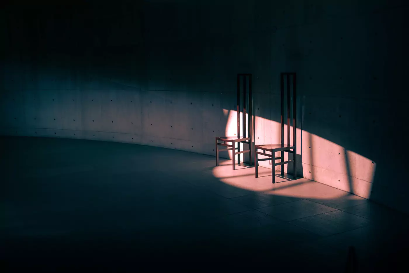
6. Identifying Distractions
Nobody wants a ton of people milling about in their travel photos. However, I’m more referring to the subtle things that draw the viewer’s eye away from the photo’s focus.
For example:
◊ A beautiful photo of a tree, but there’s a rogue chocolate wrapper in front of it.
◊ The edge of a lamp post just snuck into the top of your image.
◊ A bold logo on somebody’s clothes catches your eye way more than it should.
All of these are (usually) easy fixes in Lightroom and Snapseed using the ‘healing’ functions, and in more complex examples, easy to fix in Photoshop with the generative feature.
Identifying and removing distractions in your picture can massively increase its aesthetic appeal.
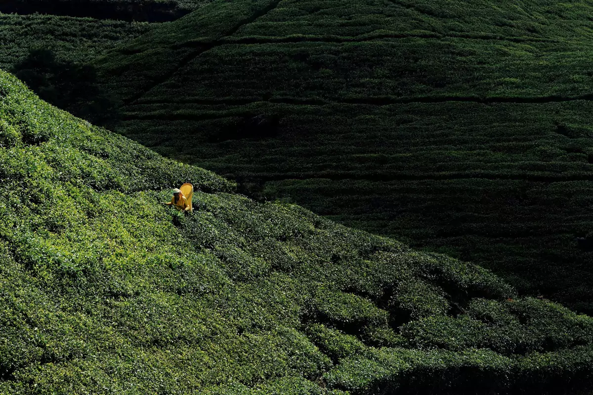
6.1. Minimising Colours
Multiple, clashing bright colours are distracting and can draw the viewer’s eyes from the intended subject of your photo.
Generally, photos with a large range of (often bold or vivid) colours tend to look less sophisticated. They can come across as chaotic and messy instead of cinematic and elegant.
One of the easiest ways to make photographs look more stylish is to identify what colours are unnecessary in your shot, then tone down their individual colour saturation and vibrancy.
Example | a photo of the Colosseum in Rome. Realistically, you can’t remove the billions of people, but you can tone down anyone wearing visually distracting, bright red clothes!
Tip | this doesn’t always work, but often choosing two opposing tones/colours for your picture can make it look more cinematic (for example, teal and orange). Eliminating other contrasting colours will result in a far more refined look to the photo.


7. Never Neglect the Sky
So many travel photo edits miss the perfection mark purely from overlooking the importance of the sky. There are several practical things to consider when editing skies:
◊ Is the sky washed out? (solutions mentioned above)
◊ Have the global colour edits you’ve chosen changed the tone of the sky to something a bit unnatural or less suited to your image? If so, use the individual blue tones slider to correct it, or mask the sky and correct via the warmth slider.
◊ Is the sky all one solid, textureless colour tone? A further way of making the sky look more aesthetic is to add an angled, darkened gradient at the top of the photo, which leads downward away from the direction of the sun. This can be magical in enhancing a late afternoon vibe for your travel shot. It shouldn’t be noticeable to your viewer, just a subtle angle that implicitly demonstrates where the sun is (examples below).
◊ Sometimes, the blue of the sky can be a bit jarring if it’s too bright or intense. Consider simply reducing the saturation a little. This quick trick can make your photo look much more elegant.


8. Crop Out Unneeded Detail or Space
Often, a good crop will *make* a photo. While there are specific ‘rules’ for cropping portraits, here, we’re talking about travel photography editing where there are an infinite number of scenarios to consider.
So, at minimum, be aware of these:
◊ If someone is facing a particular way, try to have them positioned on the opposite side of the photo, so they are staring through the empty space of the picture.
◊ To emphasise your subject, experiment with cropping in just a little further than you think you need.
◊ Generally, never crop body parts or sections of your subject.
◊ Crop out any totally empty, pointless space unless it adds to the effect you are after (negative space can occasionally be magic).

WHAT IS THE DIFFERENCE BETWEEN RAW AND JPG FILES?
RAW is a lossless type of data file produced by the camera every time it takes a photo. It’s basically all the data collected by your camera sensor before being converted into an image.
So, if your camera or phone is set to output only JPG files, then your device is taking that RAW file, processing and editing it, then giving you a JPG output.
If you tell your camera to give you the RAW file, then your device skips editing your picture, leaving you with the original file. This allows you to do all the picture editing yourself (which is much better). Often, the internal editing software is abysmal (especially on phones), applying overly high saturation, contrast and sharpening.
The RAW file contains far more data than a condensed, pre-edited JPG. This means that manipulating the photo (which you often need to do with travel photography) is way more effective if you choose RAW files.
–
RELATED | CAPTURING MALAYSIA’S LARGEST BUDDHIST TEMPLE
More Advanced Photo Editing Tips
9. Colour Grading
Colour grading is simply the changing of individual colour tones, luminosity and vibrancy in your photo.
It can be as simple as making your blues look greener, adding a tinge of orange to your shadows, or vibrant yellow tints to all your highlights. Sometimes, it’s just brightening your pink tones. Usually, it’s a combination of all these types of adjustments.
Colour grading is a very individual choice, and everyone will choose different tones when editing their photos.
However, no matter the colours you choose, colour grading is an incredibly powerful way to enhance your travel photography editing. Your shots will look more professional and be far more aesthetic. I adjust the colour-grading at least slightly on every single photo I edit.
There are several reasons why it is so effective:
◊ Adding a tinge of colour to your shadows, mids and highlights sort of smooths out the colours in your image – meaning there are less harsh, clashing colours and better blends.
◊ Adjusting individual colours can produce a very specific, cinematic mood: think Wes Anderson films or Bladerunner. Both have a very distinctive appearance which immediately sets a vibe, often achieved with just a small number of alterations.
Tip | I never leave the shadows on my street photography black, ever. It’s a personal choice, but I find my photos are improved with a tiny dash of blue or green. Again, it’s totally individual, but I’d absolutely recommend experimenting with what works for you.


10. Enhance Your Horizons
As I mentioned in my editing mistakes post – leaving an un-straightened horizon is a big no. However, there is more you can do than just straighten it!
Horizons against a sky are always in the far distance and tend to be a little washed out, pale, or lacklustre.
Whether it’s oceans or mountains that meets the sky, I’ll always put a quick mask on them, reduce the exposure a tiny bit, and sometimes slightly increase the clarity.
This typically makes them pop!
Tip | put your gradient at a slight angle if the light is low in the sky to enhance the sense of evening/morning sun.
Tip | to get a mask *only* on the horizon, put a linear gradient across your ocean or mountain tops, then subtract the sky. This usually leaves a small gradient strip that just covers the top of the land.


11. Gradients and Flat Light
If you have a photo that seems a bit flat: it might be lacking in a strong light source (or is just a bit boring). If so, consider putting some exposure gradients across the flat sections.
This gives a photo more depth than a flat, washed out image, plus draws the viewer’s eye to where you want them to look!
I’ll drop some random examples below to explain, but any time I have a flat, empty space, I ask myself if I can jazz it up a little.


12. Enhancing Your Light Source
Photography is all about light. Well, more specifically, light bouncing off a subject.
This means you really want to be constantly aware of where your light source is.
Each editing scenario is different, but I’d highly recommend experimenting with radial exposure gradients to enhance where a light source should or could be, to make your photo look more intense.
Tip | by adding a light source, you may also need to manually darken any shadows this might inadvertently brighten. This process can be quite easy, but occasionally also a lot of work, depending on the complexity of your photo.
It’s a bit of effort, but usually results in an incredibly well lit, dramatic shot.

13. Blurry Backgrounds in Travel Photography
Ok, so everyone seems to be chasing that magical background blur (or bokeh, which technically refers to the ‘quality’ of the blur).
Simply put | the best lenses, when combined with the optimal settings in the most appropriate environments, are the ultimate (and only real) way to get this effect.
It’s a natural optical feature and should be left that way.
If you can’t tell, I don’t rate the fake blur effect in Lightroom! It’s very, very bad unless you only need tiny photos (because it’s possible nobody will notice the imperfections). The edge separation is abysmal, and the inaccuracies are highly obvious to anyone who uses this software a lot.
‘Gaussian blur’ is a slightly smarter, more effective way of adding a little bit of blurry jazz, and I use this sometimes. It’s only in Photoshop though, and not worth paying for the software on its own. For more on Gaussian blur, check out this useful article by Expert Photography.
Tip | if you are lacking a nice background separation from your subject, consider using masking and light sources, instead of blur, to make them stand out.

14. Adjusting the Architectural Lines in Photos
Have you ever taken a photo of a tall building (probably using a wide lens), but all the architectural lines tend to converge/diverge? Well, this annoying optical issue can (sometimes) be fixed by using a tilt-shift lens, which kind of straightens up the angles (to put it simply).
The issue | a tilt shift lens is just a dream for most travellers, due to the insane price ($$$$$) and large size (just search Google Images for these monsters), plus a lack of flexibility and autofocus.
So, the next best thing we can do is to fix the converging lines in post processing! This is something I do an enormous amount in travel photography editing, because I take a lot of photos of buildings, streets with lamp posts, temples, doors and windows (as do many other travellers).
Lightroom (in the crop/resize section) and Snapseed (in the perspective tool) both allow small adjustments to the visual angle of a photo.
Play about with the vertical/horizontal functions – it’s pretty easy in some cases, particularly if the angles are only a little bit off. Don’t overuse this though – it’s not great for the quality of the photo and can make your shot look unnatural.


15. Manually Enhancing Shadows
If you’ve read my photography guide, you’ll know I’m *all* about the shadows. A photo without a significant light source (and therefore shadows) makes me sad and the image flat.
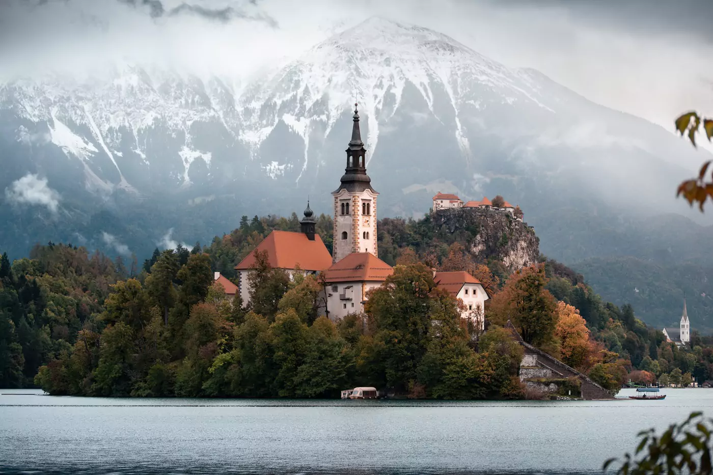
However, sometimes, the sun just won’t come out, like on our recent trip to Slovenia. So, I had to intervene and fix the abysmal lighting!
I’ve briefly mentioned above, but don’t underestimate the benefit of just brushing on some shadows and highlights manually. These can imitate a deeper, lower effect from the sun which provides an atmosphere to your pictures.
Tip | it’s possible to add some extra shadows to a subject, just to emphasise where your light source is. So, for example, you can intersect your masked subject with a linear gradient and play around with the exposure to make the subject look more dramatic.
This is *surprisingly* effective!

Final Thoughts – Travel Photography Editing
I know some die-hard people will say that if you can get it right straight-out-of-camera, then you don’t really need to edit your pictures.
Although this is technically true, I believe all travel photography can be improved dramatically with a little bit of added style and pizzazz. It’s not essential, but enhancing an image to either become the art you want it to be, or just look more like it did in the moment, is a cool ability to have and you’ll love looking at your images so, so much more.
Also, as I keep repeating, it’s the nature of the job that travel photos rarely come out perfect, every time. There are just too many variables! Developing appropriate skills to manipulate and fix the inevitable issues is the best way to level up your end product and produce wall-worthy images.
I also know that any kind of post-processing is unique to the style of the editor/photographer. So, it’s totally okay if you don’t like my choice of edits! However, a lot of the actual techniques are universal, so can be interpreted however you prefer.
I hope this has been of some help and that your next batch of travel images come out just as you’d hope!
Hi, thanks for visiting our blog! If this post has been of help to you, or you’ve just enjoyed our random ramblings and musings, say thank you by buying us a coffee! It helps keep The Restless Beans blog up and running.
Thank you, Claire + Nick


